Monday, 18 April 2011

My Evluation- part 1

In this evaluation I will be writing about the journey of the making of my music video, with theory. I will explain the usage of props and ideas, and how they fit into what the target audience may want to see when watching a music video. How effective our music video is in terms of how my digipack and poster work/reflect upon our music video, and how successful the whole project was in terms of promoting a single and music video to the audience. I will also give in detail how effect the audience feedback was. Finally I will explain the poor and great use of the media technologies I have used through out the process, for example Internet recourse's, mobile phone technologies, and video editing software.


1. In what ways does your media product use, develop or challenge forms and conventions of real media products?


The band that we have produced over this period of a time is called 'Boyz with Bowz' they are a unique indie boy band, the song that they have released is called 'Baggy Trousers.' The reason why we chose to call the band Boyz with Bowz is because it stands out, and also has a completely different meaning to other band names in the media industry.


In our music video I feel we express a use of media texts to our target audience, and communicate this through forms and conventions, we do this by representing ideas through props, costumes, lighting, characters, and location in the music video. I will now give examples for each of these media forms.


An example for props that i will use to analyse is the balloons that we used for the studio scene, the reason i am using this as an example is because it was an idea we had from the beginning. We decided to use balloons because they represent everything that the band stand for, they are bright light hearted and cheerful, they are used at parties, and represent the idea of having fun that is what indie bands are all about.


Costumes are the key characteristic in the music video because they create a character for each of the band members, and can form a theme for fans to follow when going to see the band at gigs, the feathers on the shirt and the bright coloured bows clash so much that it works, i feel that the idea of this theme relates to many other boy bands; the reason for this is because all bands have a theme that when fans go to gigs they will follow. And the idea of bows is recognisable and fun!


The characters are an obvious relation to indie boy bands, they are all cheerful and not so much corny like other band you will come across for example JLS. Each of the characters have a different characteristic that stands out, this is shown through out the music video.


The last ingredient i would like to add to this question is location, location is really important and we have used three different locations. One of which is the park, the use of the park creates an unstagged effect, as well as a childish and immature theme for example in the park they go on the swing glide through a slide and dance around and mess around, this is not something that you could see a pop boy band do, this park scene insures that their music video does not look staged which reflects on most boy bands that ensure that their music videos do not look corny or over acted, and if they are then they need to be humorous. This brings me to the first scene of the music video, which is in a house this scenes narrative is a nightmare that one of the boy band member has.
We expanded and challenged our music video by places some effect in appropriate places of the music video, the only effect we used was speed. Overall i think we have used good forms of media texts towards our target audience, that reflect on indie bands in their limit.


Wednesday, 2 March 2011

4. How did you use new media technologies in the construction and research, planning and evaluation stages?
Consider your use of the following:

For the final part of the evaluation I am going to explain how i used new media technoligies in the construction, research, planning, and evaluation. And how effective they were in terms of giving my information. Our work is presented on blogger so i had used blogger a huge percentage of the time when writing up my evidence of all the stages of the portfolio.

Youtube was used on many occasions because i had to look up similar artists to the band i was constructing for my portfolio. i also had to analyze music video of different genders, this is the best part of planning as i gain a new understanding of different media materials in the media world, for example i used music videos such as 'candy shop by 5 cent' amongst other love songs and indie tunes. When coming up with the ideas for the music video and constructing a story board this site was used to listen to the music before pasting onto our mp3 and cd.

Google was another source used as i was using this site when it came to planning and research because it gave me the clear identity of what was needed in music videos that i was planning to make such as indie codes and conventions.

The video editing software was new to me as i was only used to using the i-movie as it was simple, but after being told how to use the basics of the final cut pro i started to get the hang of it and using more than just cut and play buttons i became to discover the effects and new ideas that could be included in my music video. I was always on the final cut pro through out all my free time to make everything perfect.

The photo editing software i used was photoshop, it is a simple technology to use. But also makes photos and fonts look professional. photoshop is my favorite computer application as well as final cut pro, because i know how to use it properly and the posters and digipak always end up looking amazing. In photoshop you can change the colors of everything erase different shapes and background by just one click.

In the making of the music video the boys in the band didn't know the words to the song sung by madness, probably because it was an old song written by an old band not known to this day of age by young students. So i had to play the lyrics i wanted sung by the band over and over again, in the end it did work but we sang the words with the character so he had more confidence and got the lines write, we found that this was a good technique because the boys gained more confident and had more of a laugh in the production of it.

3. What have you learned from your audience feedback?

When given audience feedback it is a extremely good idea to respond to the feedback by changing the ideas that are expressed to need to be changed. In our case it was good to get feed back from that age group because they were our target audience in the first place. The age range started from the age of 14 up to the ages of 30 or 40,     depending on the character listening to the music. The feedback that was shared with us was given by a group of students studying media, they are around the age of 17 to 18, because of the maturity we notified the feedback given.

The feedback had improved our music video suddenly, as i was not too sure about the ending of the music video because it had too many shots and didnt end too smoothly. So the feedback helped me identify the ways in which i could improve the ending of the music video, which was to erase the last too shots of the band, meaning that the first character in the music video was the last.

One of the feedback comments was that the lighting in one of the scenes was too strong leaving shadows, in which she did not agree with but the other students in the class disagreed with this comment made and said that the lighting worked as the shadows were clearly noticed and had a good effect.

The audience when asked if they thought the concept and acting in the music video worked, had said that the music video worked on so many levels, when answering this question one person had said that the idea of including an humorous acting scene at the beginning followed by an unstaged performance for the rest of the music video worked wonders. This was the best positive feedback we gained because it was an aim to make it look unstaged yet humorous.


Finally the comments on the editing of the music video was really positive the audience had said that the use of speeding up the music video at certain times of the music video was rely effective and went well with the music, one feedback quote also said that the music video shots were good as they looked unstaged and we had many different angles and lengths. 


If i was to comment on my own music video, digipack and poster. I would have said similar feedback about the products. I would say that the music video looked unstaged and had some very humorous shots in it, i would also say that the editing and effects worked well. But i found that the images used on the poster and digipak may have needed to been taken by a professional camera, so that they would look better, and not cut from shots of the music video. I would also say that the products introduced the band to their audience really well and gave some very good codes and conventions. 


2. How effective is the combination of your main product and ancillary texts?

I am now going to discuss how effective the digipak, poster and music video work together, i will compare all the products to each over and identify the similarities that are shared upon each product. 

The digipak and poster link together as they are both sticking to a pattern. Both the poster and digipak are colorful, relating to the bows in the music video. They both stick to the pop art style, keeping to the bows.

Each bow the characters wear are different colors, creating a fashion of their own so that their fans can follow it through and wear the colored bows to their gigs. The colors of the bows are pasted on the digipak and poster , creating a theme and relationship between the advertisements and music video.

Our products of advertisements achieve their aim to promote the music video and band by introducing the new band to the media world by involving images of the band together in an unstagged format, relating to the music video, in the music video it was tasked to make it look as natural as possible, so ideally we had to keep the digipak and poster similar to this style.

The fonts that are repeated on the cd digipak and the poster is a comic themed font that kinda relates to the idea represented in the music video as the beginning of the music video is about a dream creating a humorous idea, we wanted the poster and digipak to have a clip of this, which was pasted on the back cover of the CD album which was the character of the mum played by Jamie.

I feel the images are recognizable ecpesciallydidgipak due to the pop-art theme that stands out to the audience.


Friday, 18 February 2011

Latest problem

After spending alot of time to try and make my digipack perfect, i realised that other members of a2 media were doing different to me, i forgot to put disk desgin on the pack, and just placed the background, and when i went to create this it wouldnt let me.

Another problem is i didnt use my common sense and realise that rough trade and Song bgm are two completely different record labels, so i need to go back and change that.

Also i missed out the terms and conditions (what i call it) so i need to change that.

ideas for promotion

-

Internet-

 Everyone uses the internet in this decade, because it has every answer to any question and can help us gain all the oppertunities. This means only one thing, that it could possibly be the best way to promote our band, and new release, as they can buy it through itunes and other sites.

The ways inwhich we could promote through the interent, is to put banners up on sites that audiences visit, we could also input interviews on youtube, to make the band look as exclusive as possible.


Facebook/social networks- this is always a good way to promote singles and realeses as people tend to be living on social networks expesially our target audience.

posters- posters to be pasted up almost everywhere, catching everyones eye.

tv- adverts, interviews and previews. TV is seen by all eyes.

location

Because we had to change our plan, we needed to change our location...

location 1- is the same as our original plan, which was to film in a white room, and put balloons in it. This is what we will label the 'studio'.

location 2- in the park, this is a scene where the lads will be having fun, hopefully giving an unstagged effect.

location 3- in a house- this is where the scene will be where nik has a night mare

Example poster

mcfly-union-jack-poster.html.jpg

This is a example poster, something that i hope will be similar to my poster, in the respect 


poster


this is the poster that advertises our single being out on the 21st february, the idea was to make is graphical and bright to attract our audiences eyes. 


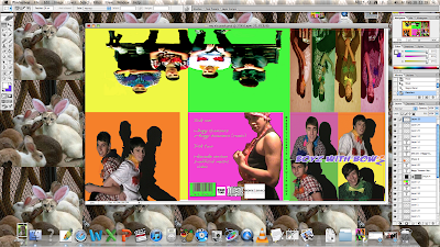
This is my digipack that i made for the single Baggy Trousers, its fun, its loud, its happy and bright.. which is the definition of the band..

front cover- the front cover is the repeat of the advertisement poster, keeping to the pattern. It has four images on it, that have shadows behind, signifying their background as characters in the band, each shot of each of the boys in the band reflects on their personality. And the significance of the color usage exaggerate who they are, they each have bows, and each of these bows are different colors, that represent the personalities of the character. For example that top left hand corner is Jamie, who is posing to the camera, his bow is pink that is exactly him, not i the homosexual way but in the 'i'm a ladies man way'. the right hand top corner is Nick, introduced as the main character of the band, he is orange, the representations of orange are bright and cheerful, with a little bit of mystery.

The bottom left hand corner is Luke, his is a yellow background reflecting on his cheerful and social personality, the fact that he is laughing in the photo shows that he is approachable. The last image on the right hand corner, is of tommy, which is green, i feel the green represents happiness and kindness.

The font on the front cover is a purply blue color, a rather light color, that shows their uniqueness and boldness. The effect of the 'z' falling of shows that they are unique and have a bit of an edge to them.

above this image is the inside image, so that when you open it up you see the images of all four of them, but in a graphic way, each of the photos are tinted the colors that their bows are, this image reflects on an 70-80's styled film.

The enlarged image beside this is of the boys together on a bench, this is a good image because it shows the friendship between the for boys. i decided to make it so big because then when the audience open the cd it reveals a light hearted image... which can be rather effective.

The orange image bellow this is of two of the band members looking up at the character, this could be classed as humorous and a sign of the friendship, i feel this image works in the digi pack because it is so corny, and i feel this is a good thing because you might say that the band takes the mickey out of corny groups.

the back cover is of Jamie in his mums outfit. As i feel this is possibly the best image idea of the music video, so it is quite sweet to have this as a backcover, as it finished of the music video, it can finish of the cd cover.

making of my digipak


This is a screen shot for my digi-pack.. as you can see i have made them two look similar, keeping a consistent pattern. 

making of my poster


This is a screen shot for my poster, this is evidence of my usage and time that i took make the poseter. 

using final cut pro


These are two screen shots that are evidence of the process that i went through to complete the music video.. before i was used to final cut pro this looked really hard to use, but now that i am getting the hang of it, it looks a little less confusing. 
Rough Trade..


this is another possible record label that we are likely to use Rough Trade Records is an independent record label, based in LondonUnited Kingdom. It was started in 1978 by Geoff Travis.


Rough Trade are two independent record shops based in London, UK.
The first Rough Trade shop was opened in 1976 by Geoff Travis in the Portobello Road district of west London. In 1978 the shop spawned the famous Rough Trade Records, which was to go on to be home to bands from The Smiths to The Libertines. In 1982 the two separated and the shop remains an independent entity from the label, although links between the two are strong. At the same time the shop moved from its original location on Kensington Park Road round the corner to Talbot Road. In 1988 a shop opened in Neal's YardCovent Garden. At various times there were also shops in San Francisco (on Grant St., then Sixth Street, then Haight Street), Tokyo and Paris. They were eventually closed following the rise of music sales on the internet. Rough Trade replaced these stores with an online music store. In 2007 they also opened in Dray Walk, Brick Lane in east London.
In 1990, Nirvana played a gig at Rough Trade Records in San Francisco with TAD, Sampling songs soon to be on the Nevermind Album.


ce6e13cb567f0f75.jpg

Sony BGM..


This is going to be the supporting record label for our music video. 


Here is some information i found out about Sony BGM...


Sony BMG Music Entertainment was a global recorded music company


Background

In August 2000, statements by Sony Pictures Entertainment US senior VP Steve Heckler foreshadowed the events of late 2005. Heckler told attendees at the Americas Conference on Information Systems "The industry will take whatever steps it needs to protect itself and protect its revenue streams... It will not lose that revenue stream, no matter what... Sony is going to take aggressive steps to stop this. We will develop technology that transcends the individual user. We will firewall Napster at source - we will block it at your cable company. We will block it at your phone company. We will block it at your ISP. We will firewall it at your PC... These strategies are being aggressively pursued because there is simply too much at stake. BMG in Europe experienced a similar scandal in 2001 when Natalie Imbruglia's second album - White Lilies Island - was sold with copy protection measures, but without any warning labels. They were eventually replaced by BMG,but the company made clear intentions to continue copy-protection methods.[7] In the United States and Germany, Sony used copy protection on N' Sync's 2001 album Celebrity. The British version of the album was unprotected European promotional copies of Michael Jackson's 2001 single You Rock My World were also released with copy-protection.

sonybmg_logo_12.jpg

Thursday, 17 February 2011

Music videos that i feel are relevant to mine.


Supergrass are really similar to our Band and music video, they are cool exclusive, old style, i mean look at their costumes. The narritive of the music video too relates to our music video.

Making of my music video


It was the first time i used final cut pro. And to know that i had the oppertunity to use such good quality equipment like the proffessionals in the media world, i was not going to let it down. I sat for hours on end working out how to use it, and use effects, i learned the basics and worked my way up, i felt like i was in the real world making this for a company, it came to me that i could do it.

I sat by the mac for ages, i cut out all the mistakes and made it into as much detail, i did this so much that i became obsessed, i was continuelsy using it, all the hours i had to spare, the song was played so much that i know it inside out now. It took a long time to get used to, but now i got the hang of it i officially hate the original, 'I movie.' As a media student i have grown to learn so much more.

Target audience..

The target audience of our music video will be from the younger teen years which is around 14 years old, up to as old as the mum or dad of the teen, around the age of 30 or 40, as the songs that Boys with Bowz make are similar to the tunes that the typical parent would listen to when they were younger.


  Occupation- they can be from a student to a worker, depends on the person.


Interests- singing dancing, socialising, drinking, watching Tv, blarring music out, and family.


Brand new plan!

Costumes-

For the first part of our new plan, we are going to give the characters a scene to act out. They will be in a dream on Nicks, so we need to make them into characters..

Nick- wear Pajamis

Jamie- Being the mum, this will be good the idea is to dress him up in an apron and netted hat, but we dont won one of those so it will be a shower cap and give Jamie some fake boobs, we will also draw tattoos on him, to make it more funny, Jamie is going to be notified as a masculin mum.

Tommy- Tommy will play the part of the dad, so he will wear a suit, as a working character. He will also wear a fake matache, and glasses, giving that father look, like an American father.

Luke- luke will play the part of the little sister in the dream, so he will wear a fur coat red lipstik and a head band, in this he will look as girly as possible so he will be blowing and admiring his nails...

This dream can be classed as a stereotype of a typrical family, the housewife, working father and extremely girly girl!

Brand new plan!

Location!

We have two locations fresh from our other idea of a music video, these are..

A house- we are going to use Lukes house as our first scene location. This is were our dream will be, in the dream Nick the quiet character will have a nightmare about his friends being his family.. his pal jamie will be his mum and wake him up, the other two friends will play characters to be his dad and little sister. This will hopefully humour our audience.

Park-The next new location will be in the park- this will give an unstagged feel, giving the effect of firends having fun in the park, but becuase they are old and meant to be grown up, this is a weird feeling, as they are wearing bows and checked shirts!

Studio- The third location is in a white big room , this was originally were we wanted it to be, in our other music video. But we kept the idea this is were the botys will sing and mess around.

My digipack and poster making

The making of my digipack and poster

The idea was to outline the bows and to make them look great for all audience types. I wanted to meet as many audience types needs. That means girls and boys, teens to adults, for all the family to sign to and to reconisge. This meant to make it happy and bright and keep the music possitive and catchy, which meant the poster and the CD had to match!

The colours needed to link to the artist and denotations and conotations needed to be everywhere! The brightness needed to attract all ages and genders.

I made it look quit artists i have to say.. it looks like the work of a favourite artist of mine Andy collard. It looks very commercial and colourful, which i love!!

Wednesday, 16 February 2011

what have i learned from my audience feedback

What have i learned from my audience feedback?

From the feedback that we have received from the rest of the class, we were please to find that the expectations of our music video were met, we aimed to make it fun, and humorous especially at the beginning,  then when the class giggled at parts and fed back that it was really good and rather funny, we were pleased.

They also made a comment that it looked un-staged that was another progress that we made.

A student from the class made a comment that the lighting in part of the music video was too strong, i had to notify that it was meant to be that way. Also another person in the class made a comment that the shots on the bench were too long, i agree strongly with this comment made because during filming, we did do close ups of the group of the bench singing but after watching it back i forgot to forward it, which meant that we filmed over it.

codes and conventions of a music video

In a music video it is key that you can read into it; find out what it represents, for example if it were candy shop by 50 cent, you would recognize the sexist remarks and issues that the music video has.

Definition of code- looking up on the internet i found that code means what something stands for, for example a code for a rose would be passion and love, the thorns on the roses define (in code of) the danger and death of this.


        a. A system of signals used to represent letters or numbers in transmitting messages.


b. A system of symbols, letters, or words given certain arbitrary meanings, used for transmitting messages requiring secrecy or brevity.


Definition of conventions-

What i have learned from the definition of convention is that, it means that what props stand for, for example if someone was to wear a crown in a music video it would stand for power and ownership


  • The codes and conventions in media can be separated into 3 distinct groups -
- Technical (camera techniques & shots),
- Symbolic (ie clothing, colours)
- Written and audio (music etc).
These give the text meaning and determine the response of the viewer. They can be used as a basis for simple text analysis. So in order to compose any work related to media you should con

Friday, 4 February 2011

feedback for our music video

  • After we showed our music video to the rest of the class, we were given feedback, both positive and negative.
  • one of the students said that we should have lit the studio part much better, but on our defense this was purposely done, giving a rather commercial effect. and making rather beautiful shadows of the boys, this could connotate the idea of their current backgrounds and how they are different from other bands. 

  • This is some of the positive aspects of the music video: 


  1. Editing-  Gives it a good pace, hectic just like the song is.
  2. Performances-  Look genuine, un staged and fun.
  3. Its just fun and funny.


      and here are the negative, these are the areas of improvement. 


  1. Park bench shots are too long
  2. Park slide scene could have been sped up , it drags on a little bit
  3. Gun kissing scene should have been the last cut
     I went back to the music video and changed the last part of the music video, cutting out the rest of the clips to              create the Gun kissing scene to be the last one. 

Thursday, 3 February 2011

planning

We have decided that we are going to have a colour for each of our band members. But they need to be specific.

Pink will be jamie- as people see him as the ladies man, and confident.

Yellow will be luke- as he is the cheerful one, and the most social, and very possitive.

Green will be Tommy-green represents a culture of pride, and a sense of happyness and maturity.

Orange will be Nick- being a firey colour it represents the idea of mistery and silence.

Tuesday, 25 January 2011

our music video


This is our music video, after a lot of stress and fun we finally created our cover of 'baggy trousers-madness.'

overall i am very pleased with the outcome, i feel it gives an unstagged and natural feel, unlike most videos our video is about friendship.

It took me a long time to sync the song with the miming, and to get the music to go with the music but i think the whole music video is good.

I would like to go back to edit some bits out and add a little more effects for detail, for example the beginning part i would have liked to make it look more dreamy, by making it disfocused or to make it look a little more as though it is a dream.

I am very proud that we came together to make such a possitive video, because usually videos look rather doll if they are about love or quit sad.  

Thursday, 13 January 2011

Resolution

We have now decided that this is how the music video is going to go..

Starts of like a the 'i want to break free' from queen style, where the singers are dressed as different characters. So one of the characters are a mum, the other character is a daughter, and one more is the dad. -turns out that the forth boy was having a bad dream about his friends.


So he wakes up and meets his friends for a day at the park.. we hope that this scene will look a little like boys in mischief.

The main feature is the dream, which has obviously disturberd the character who keeps getting flash back of the dream.. for example one of the flash backs will be when jamie is running towards nick (the boy) and jamie suddenly turns into the mum that nick was dreaming about.

Sunday, 9 January 2011

Our Big problem.. resolution.

Everytime we try to communicate with all 8 actors, some of them let us down. Creatin stress, as we cant film. So we have decided to change the idea of the music video. instead of four other actors coming in to shoot the business men, we are going to keep four, being our band members.

Here are a few of the ideas we came up with..

  1. Shots showing the relationship between the band members
  2. Having two of the band members being business men and two being the immature ones
  3. messing around
One idea i have that i feel will make the music video is if the characters hold up lyrics to the song, so this will happen for every chorus.

one of the band members dressed up as a mum and wakes up boy band members, humerous.

playing pranks on each over, and play fighting. Boys with mischief

in the Park.

and in the studio